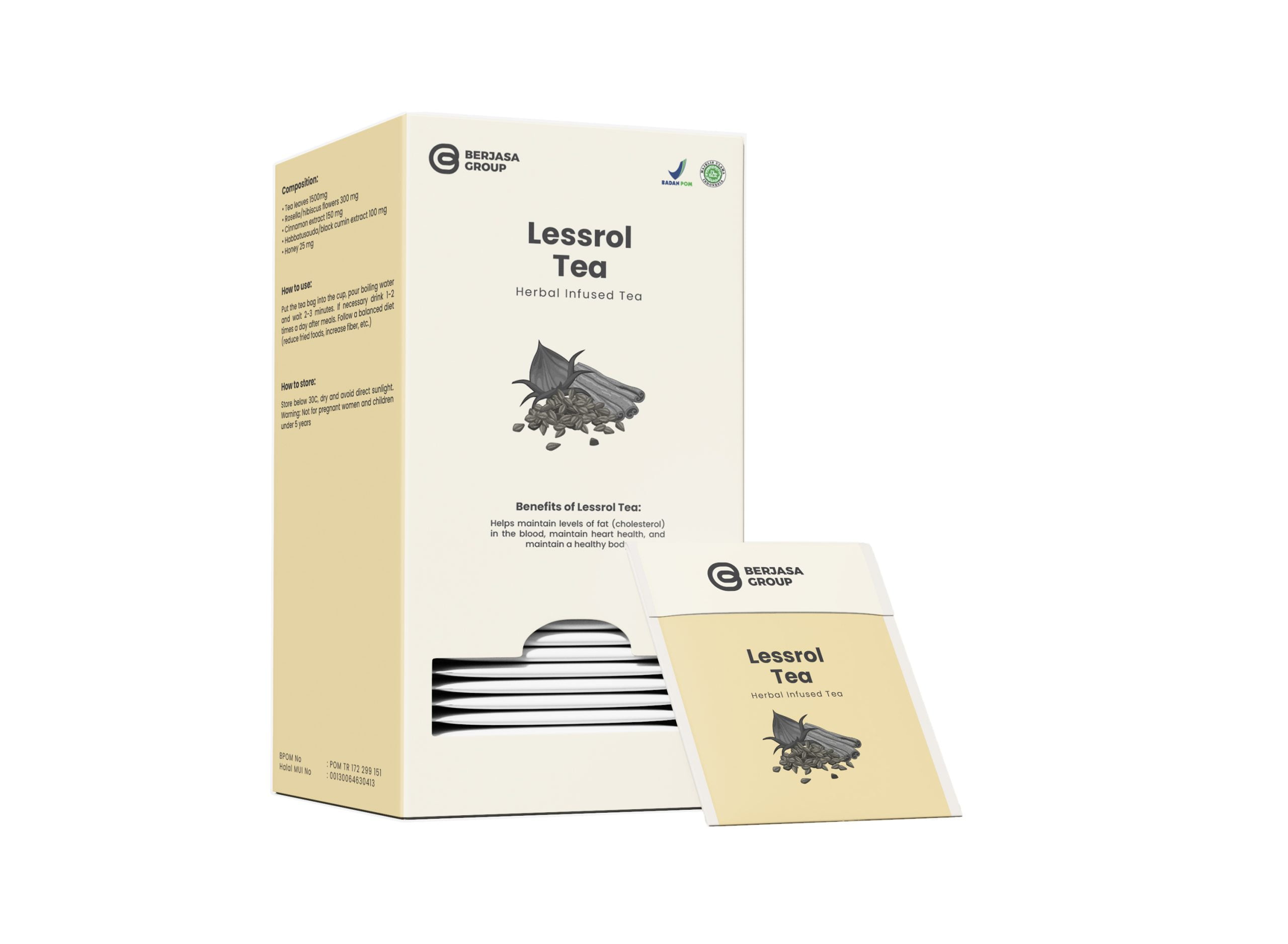
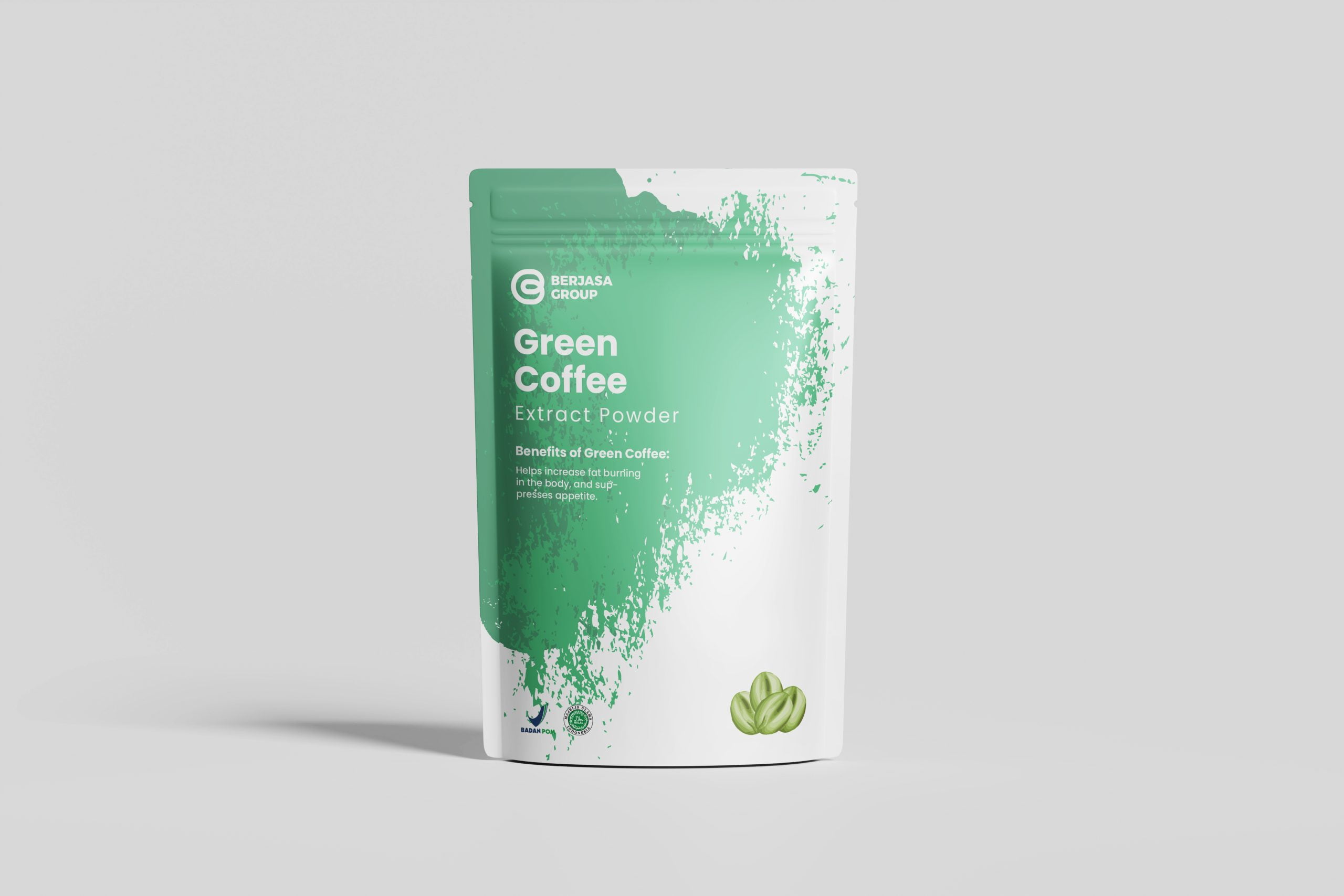
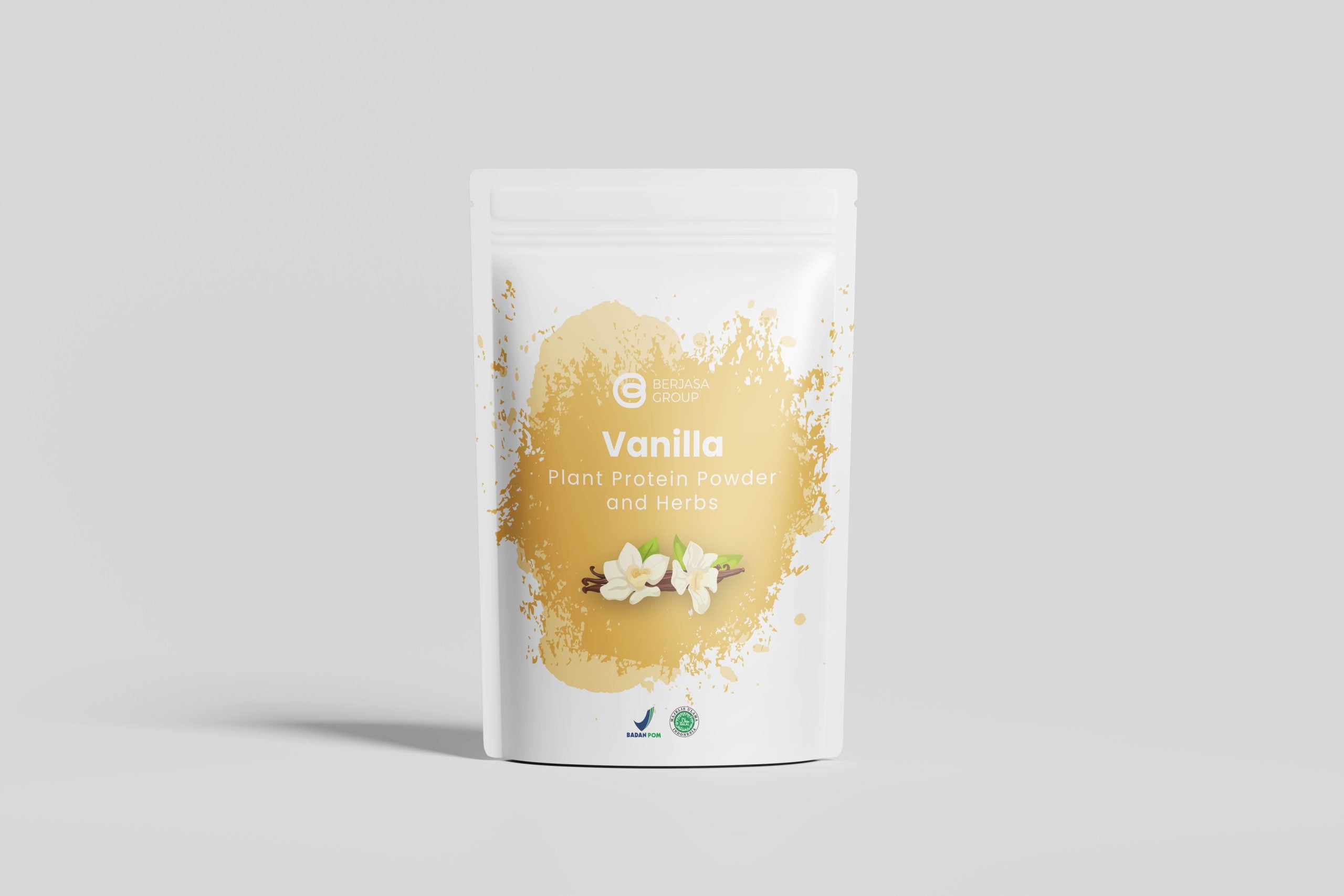
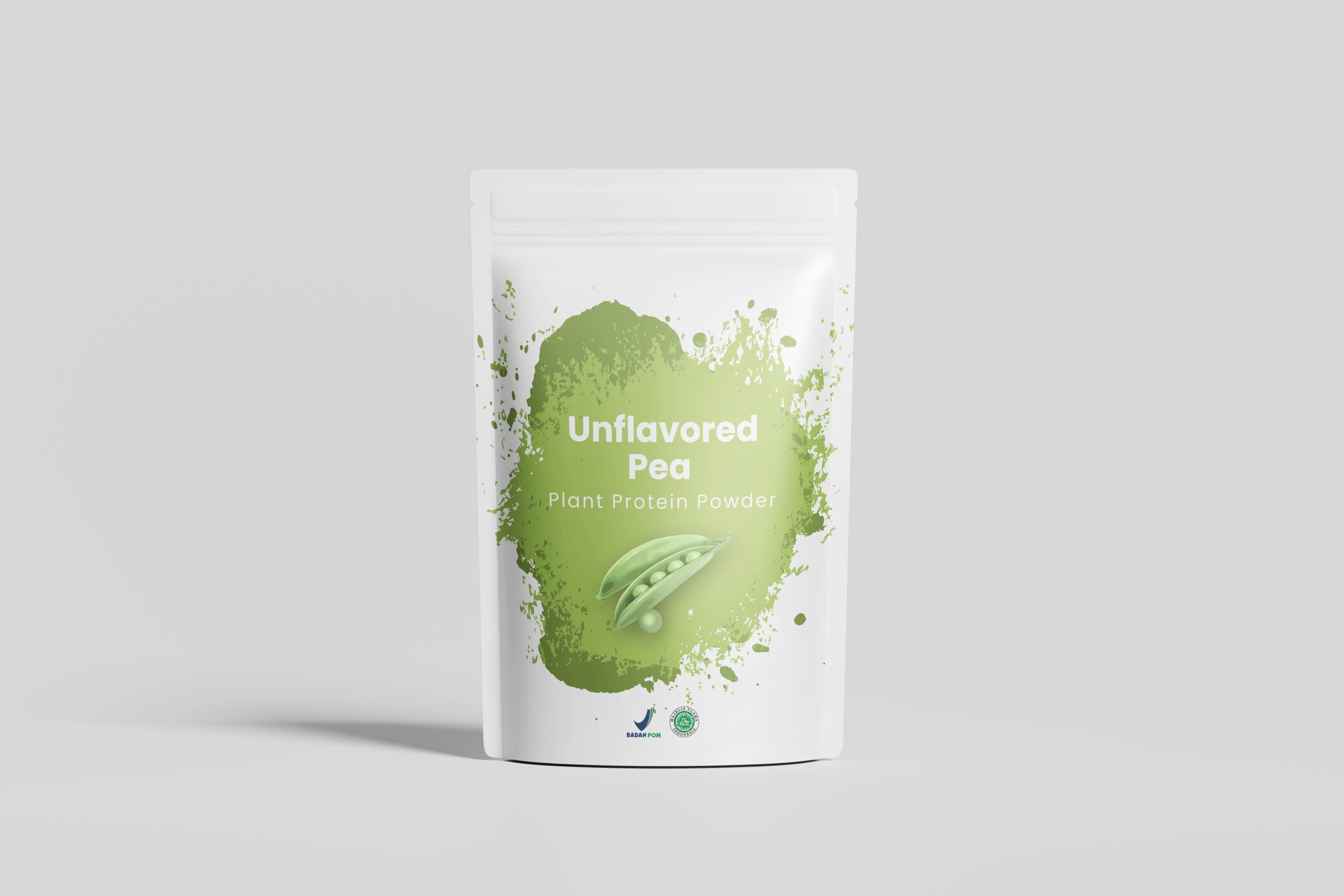
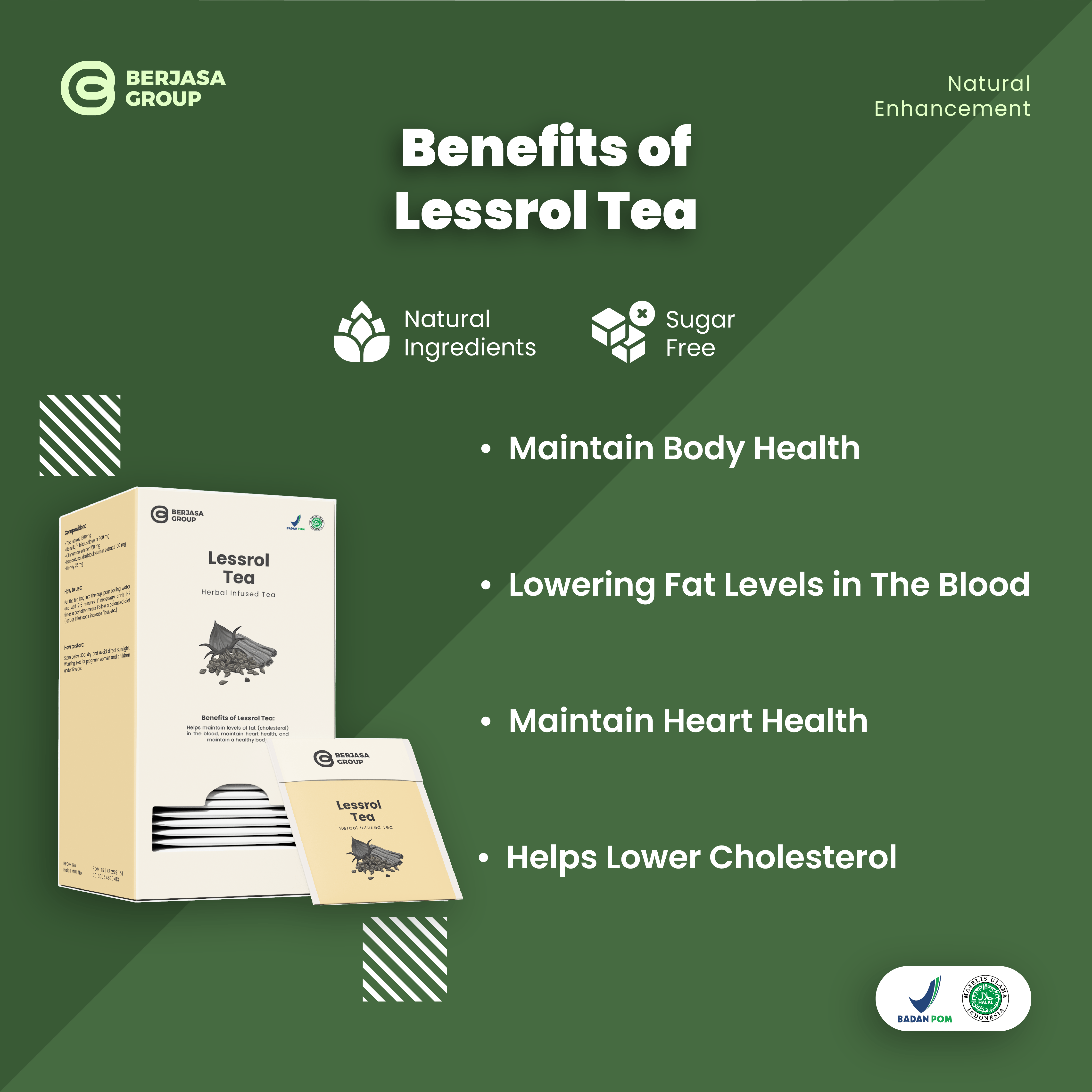
Portfolio.

Berjasa Group

  • Art Direction
  • Branding
  • Graphic Design

Brief

The Berjasa Group rebranding project aimed to create a modern and professional brand identity that reflects the company’s commitment to providing affordable and safe medications. The primary objective was to design a logo and product packaging that aligns with the company’s mission of promoting health and well-being. The challenge lay in balancing a contemporary aesthetic with the traditional values associated with healthcare. The final deliverables were designed to establish Berjasa Group as a trusted and reliable source of affordable medications.

Engagement

The Berjasa Group project involved creating a visual identity that communicated the company’s values of affordability and safety. One of the key challenges was to develop a design that was both modern and reassuring, considering the sensitive nature of the healthcare industry. To achieve this, we conducted extensive research into healthcare branding and consumer preferences. The final designs incorporated elements that conveyed a sense of trust, reliability, and accessibility.

About Client

Berjasa Group is a pharmaceutical company dedicated to providing safe and affordable medications to the public.

Services

  • Logo
  • Packaging Design
  • Product Post Design

Years

2023

Logo

Form & Shape Analysis

  • Letter B

    The logo's primary element is a stylized combination of the letters 'B' from 'Berjasa'.

  • Letter G

    The logo's primary element is a stylized combination of the letters 'G' from 'Group'.

  • Organic Shape

    The overall shape of the logo is organic and flowing, reminiscent of natural forms such as leaves or plants. This reinforces the brand's association with natural products and holistic wellness.

  • Colors

    The dominant color, a deep, muted green, is associated with nature, growth, and healing. It conveys a sense of tranquility, reliability, and harmony. The addition of a subtle orange accent adds warmth and energy.

Philosophy

  • Natural Approach The organic shapes and the use of green suggest a strong connection to nature and a commitment to using natural ingredients or processes.
  • Harmony and Balance The symmetry shape convey a sense of harmony and balance, suggesting that strives to create products or services that promote well-being and equilibrium.
  • Growth and Renewal The organic shapes and the use of green also symbolize growth and renewal, suggesting that the company is dynamic and forward-thinking.
  • Trust and Reliability The simple, clean design and the use of a recognizable font convey a sense of trust and reliability.

Graphic Design