Cocofleet
- Branding
- Graphic Design
Brief
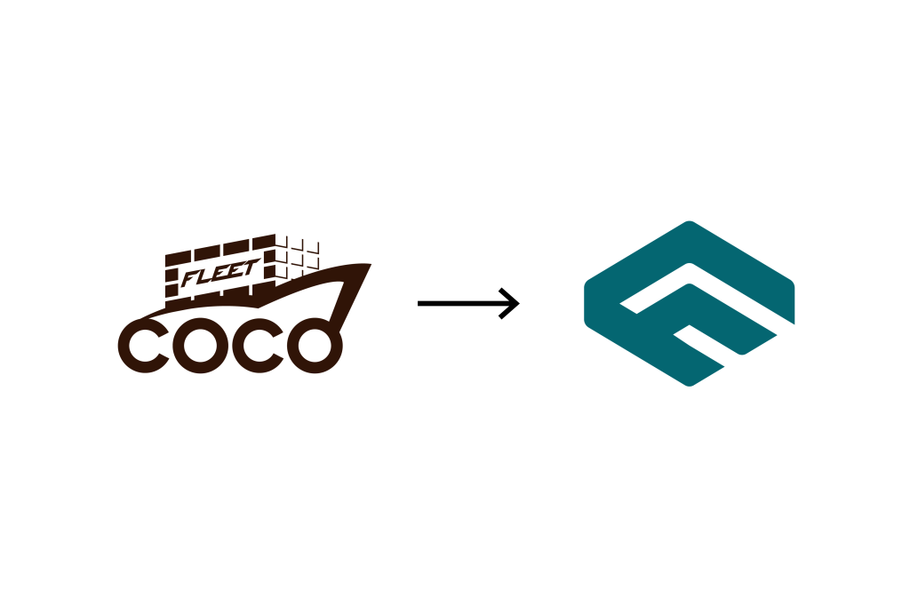
The CocoFleet rebranding project aimed to modernize the company’s visual identity, aligning it with the dynamic nature of the coconut charcoal briquette export industry. The primary objective was to create a logo that effectively communicates the company’s core values of sustainability, innovation, and global reach while maintaining a strong connection to its roots in the coconut industry. The project sought to develop a visual identity that would enhance brand recognition and appeal to a broader audience.
Engagement
I spearheaded the rebranding project for CocoFleet, a leading exporter of coconut charcoal briquettes. A key challenge was to balance the company’s heritage in the coconut industry with a modern, forward-thinking image. Through extensive research and collaboration with the CocoFleet team, we developed a comprehensive rebranding strategy that successfully modernized the brand while preserving its core identity.
About Client
Coconut briquette
factory and wholesale supplier. Manufacture and supply coconut briquettes for hookah in Indonesia
Services
- Logo
- Packaging Design
Years
2024
Logo
Form & Shape Analysis

Letter C
The integration of the letters "C" into the logo reinforces the brand name as a coconut "Coco".

Letter F
The integration of the letters "F" into the logo reinforces the brand name as a fleet "Fleet".

Leaf-like Shape
Symbolizes the company's connection to nature and the coconut industry, representing sustainability and eco-friendliness.

Colors
Dark Blue represents trust, stability, and intelligence, reflecting the institution's characteristics. Orange symbolizes enthusiasm, energy, and creativity, depicting a dynamic and innovative learning environment.
Philosophy
- Sustainability The organic shape within the logo signifies the natural origin of the product and the company's dedication to eco-friendly practices.
- Quality The hexagon shape represents stability and reliability, reflecting the high quality of CocoFleet's products.
- Innovation The intertwined letters C and F symbolize a dynamic and forward-thinking approach to the industry.
- Global Reach The clean and modern design appeals to a broad international audience.
