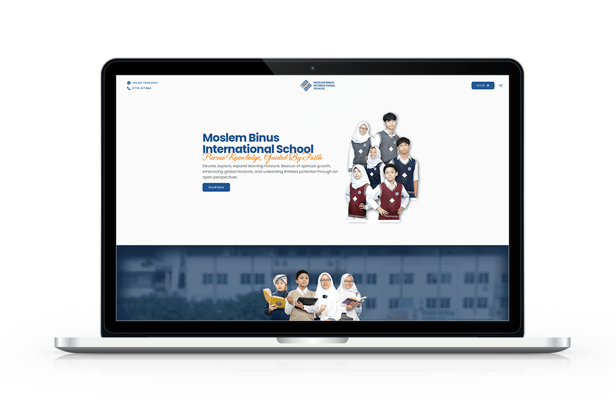
Moslem Binus
International School
- Art Direction
- Branding
- Multimedia
Brief
The M-BIS rebranding project aimed to elevate the Binus brand by introducing a fresh, modern identity that positions the school as a leader in innovative education. The primary objective was to create a cohesive visual identity and digital presence that reflects the school’s mission of pursuing knowledge guided by faith.
The project sought to enhance the school’s appeal and visibility, ensuring that it stands out in the competitive educational landscape. The rebranding was designed to be forward-thinking and aligned with contemporary design standards, emphasizing the school’s commitment to excellence and innovation in education.
Engagement
In 2023, I spearheaded the comprehensive rebranding project for Moslem Binus International School (M-BIS) under Yayasan Bina Nusantara. This endeavor required a holistic approach to modernizing the school’s brand identity. One of the key challenges was addressing and overcoming the resistance to contemporary design approaches from some stakeholders who were unfamiliar with modern aesthetics.
Through thorough education and clear communication of design benefits, we managed to align everyone with the new vision. The result was a cohesive and innovative brand image that effectively represented the forward-thinking ethos of M-BIS.
About Client
Moslem Binus International School is a progressive educational institution integrating Islamic principles with modern learning.
Services
- Logo
- Web Design
- Videography
- Photography
- Marketing Materials
Years
2023 – Present
Logo
Form & Shape Analysis
Arabic Calligraphy
The use of Arabic calligraphy as the base of the logo provides a strong religious and cultural nuance. The letters "M" and "BIS" stand for Moslem Binus International School.
Three Tiny Squares
Three Pillars of Education. Representing character, intellect, and spirituality. Unity in Diversity. Different yet united squares symbolizing the diversity of students and staff with a common vision.
Separator Line
Bridge, connecting the Islamic world with international education. Equilibrium, balancing traditional values with modern innovation.
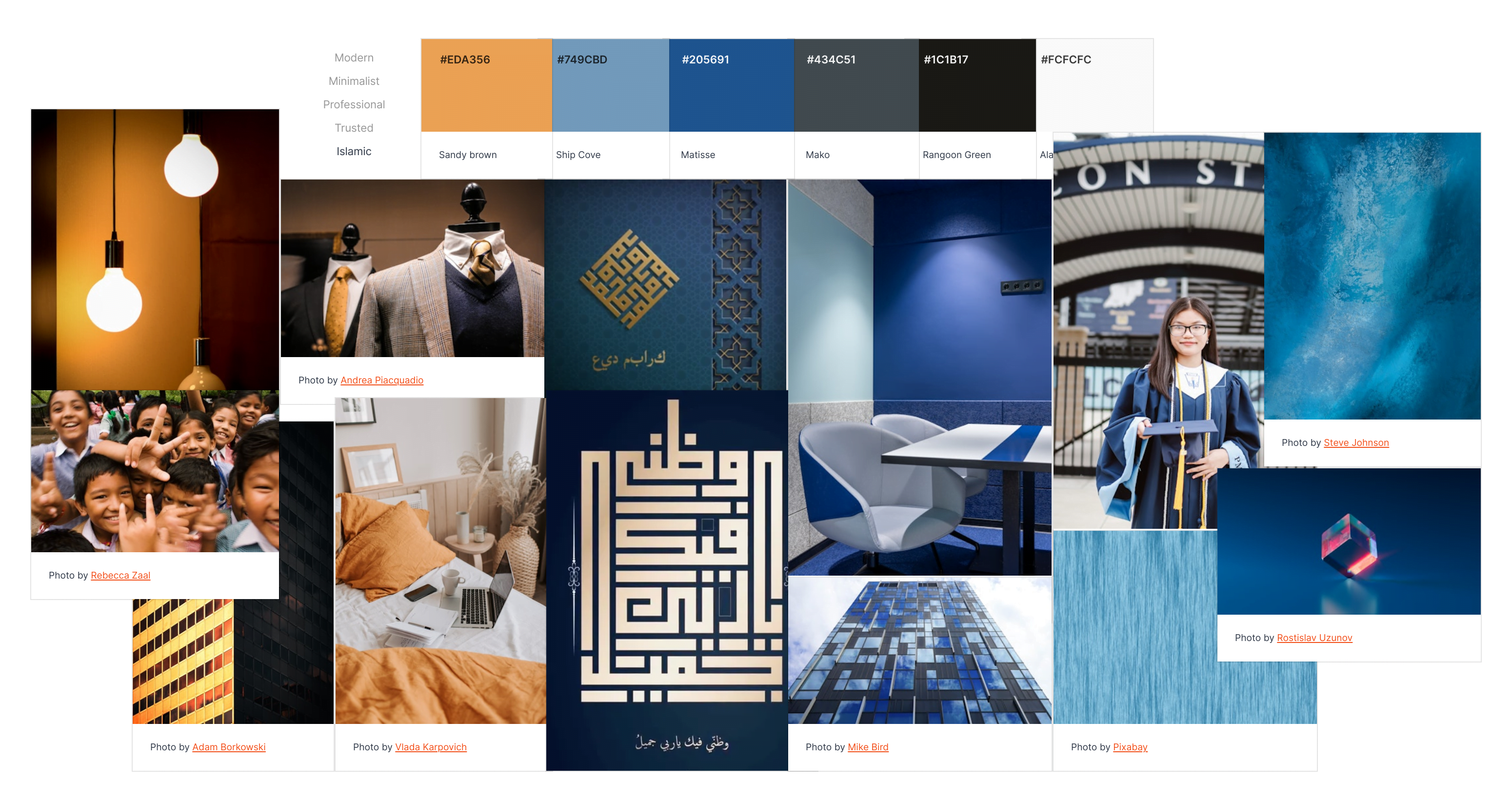
Colors
Dark Blue represents trust, stability, and intelligence, reflecting the institution's characteristics. Orange symbolizes enthusiasm, energy, and creativity, depicting a dynamic and innovative learning environment.
Philosophy
- Rooted in Islamic Tradition The Arabic calligraphy foundation shows a strong commitment to Islamic values.
- Globally Oriented The separator line and dark blue color indicate openness to international perspectives.
- Innovative and Dynamic The three squares and orange color reflect a spirit of continual growth and adaptation.
- Balanced The logo successfully integrates traditional and modern elements, blending religious values with global education.
